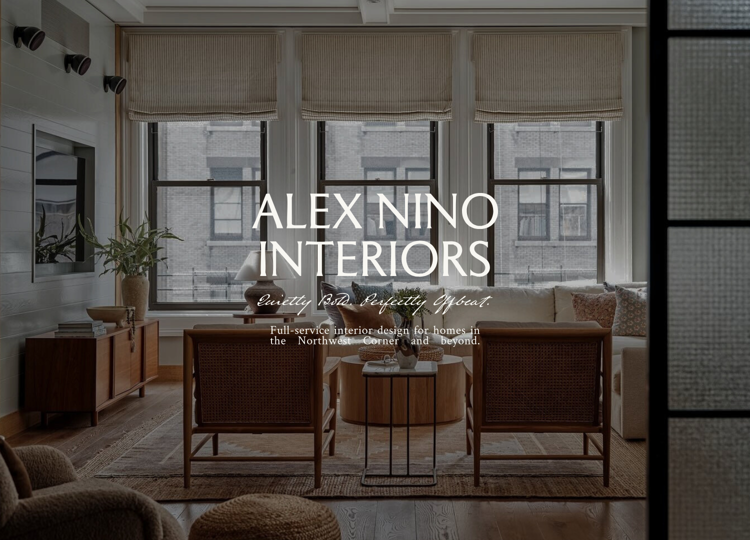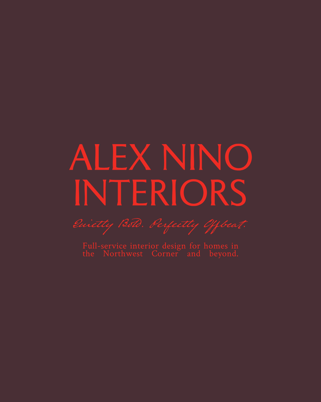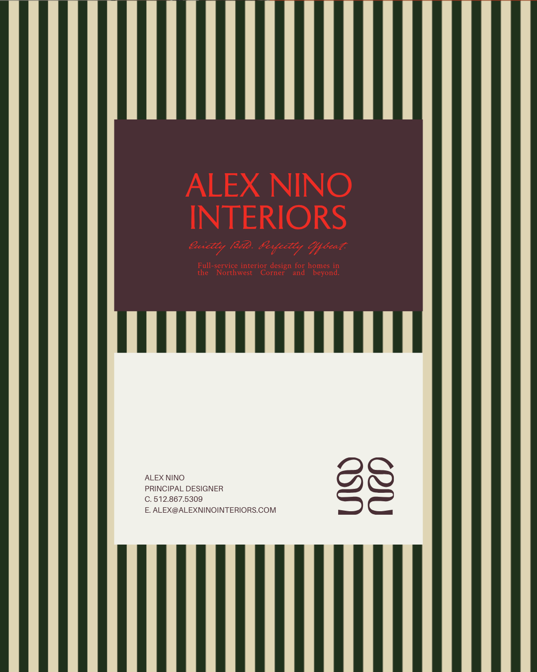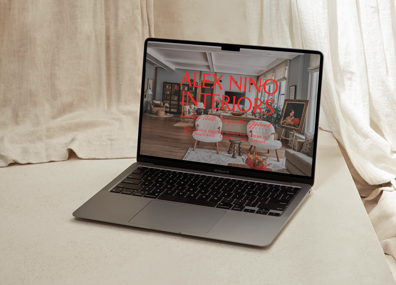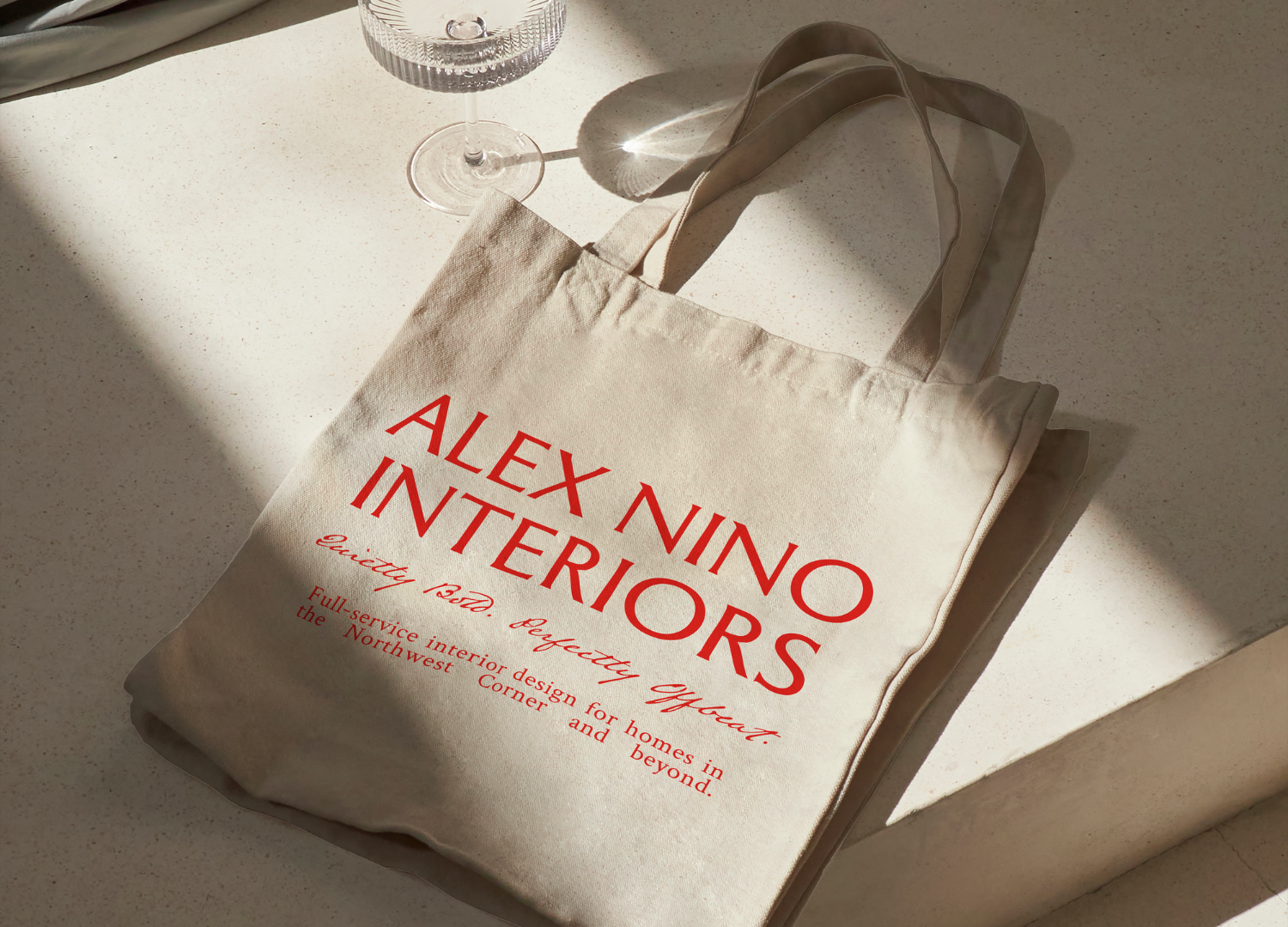
Alex Nino Interiors
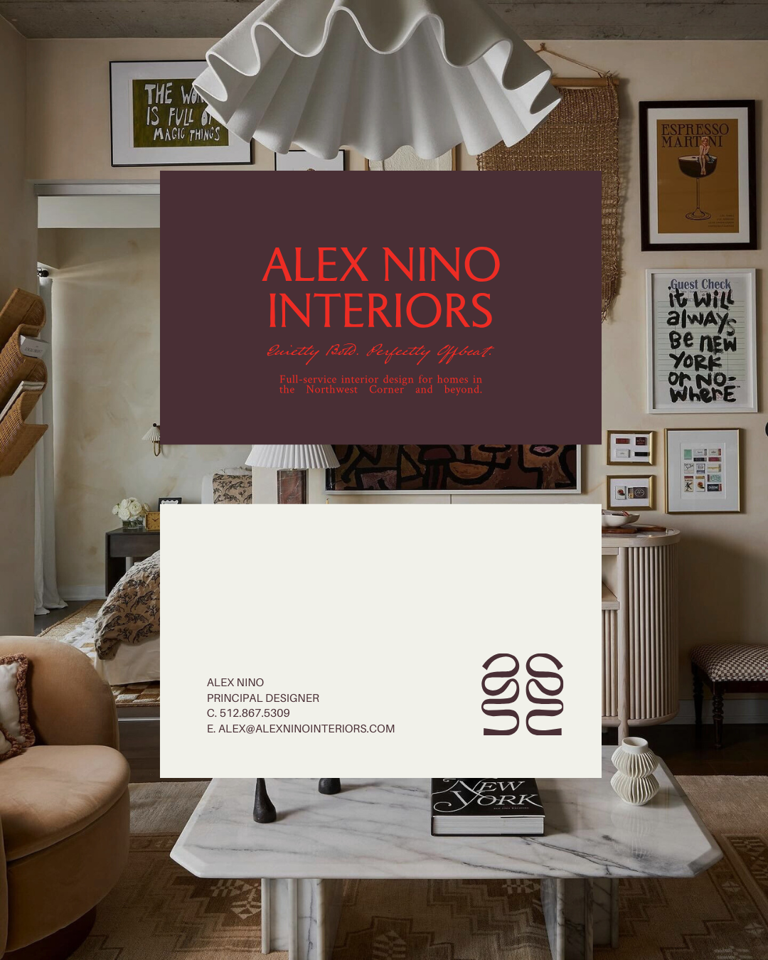
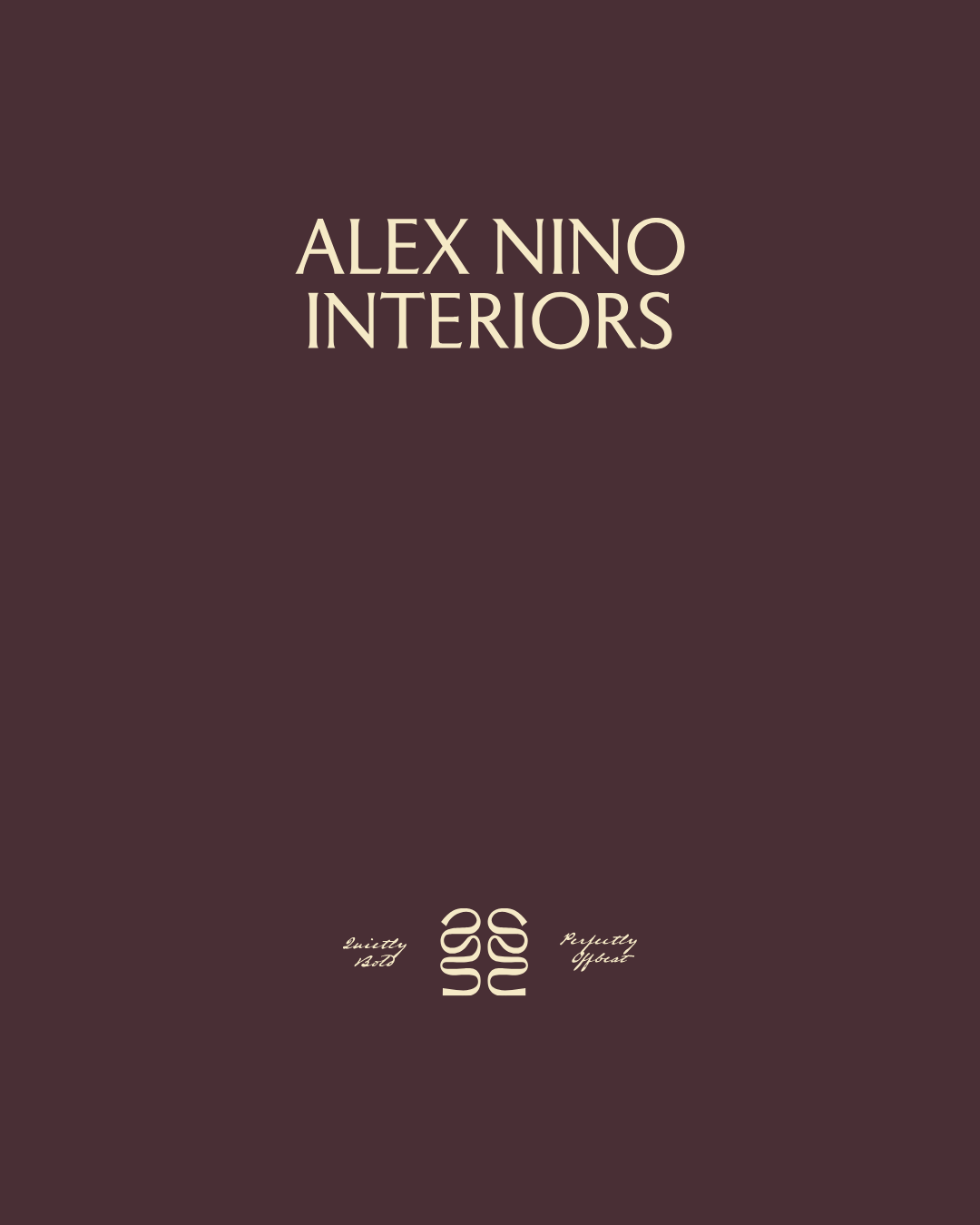
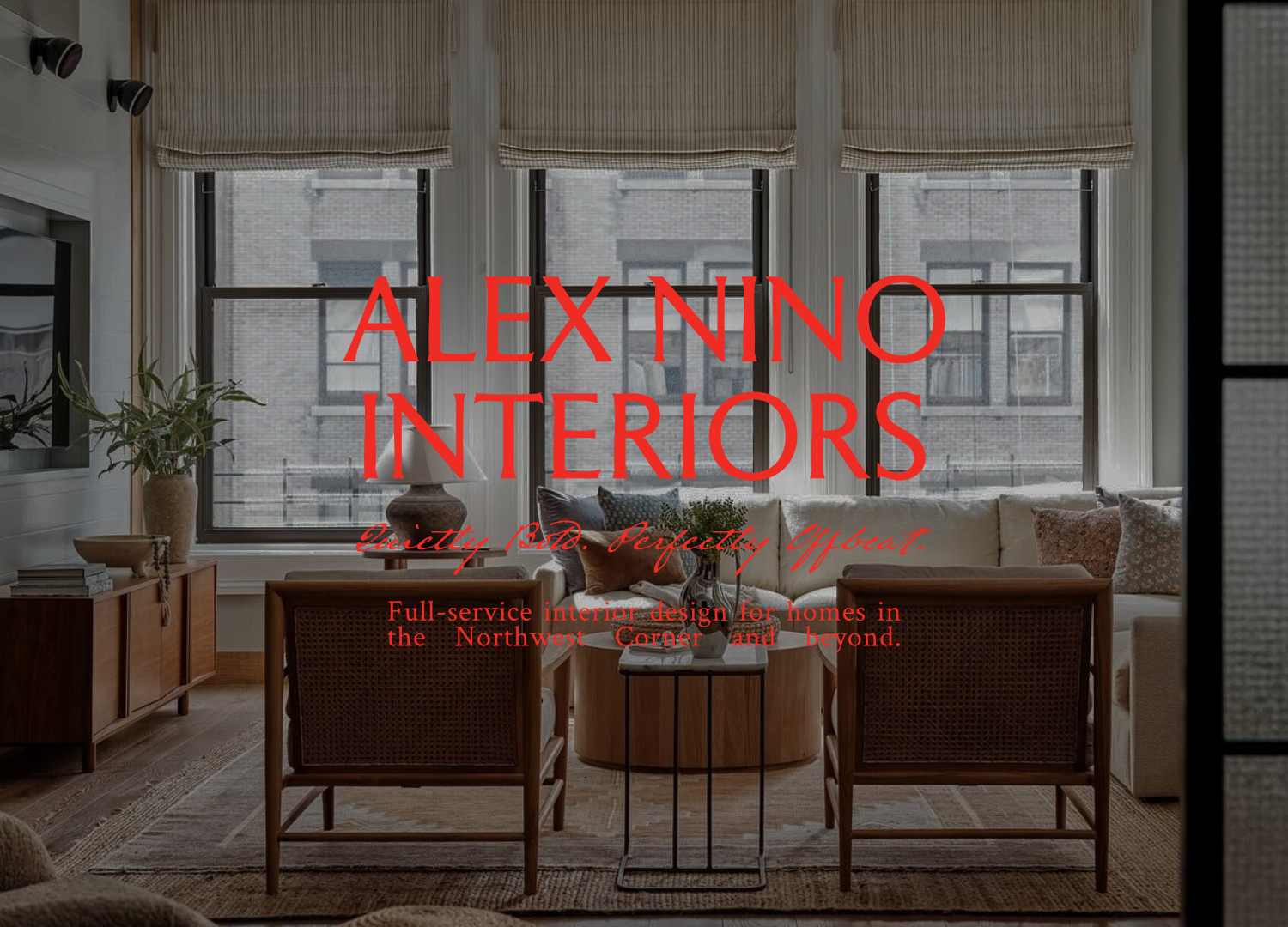
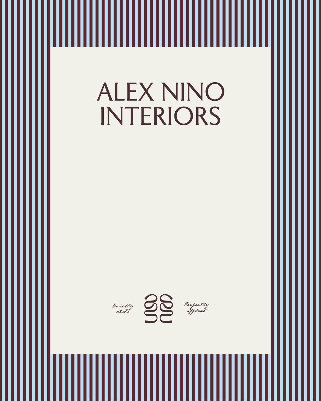
With a design perspective that embraces contrast, personality, and quiet confidence, Alex Nino Interiors needed a brand that felt both intentional and unexpected. We developed a rich, moody color palette grounded in deep plum and warm cream, layered with bold accent tones that nod to classic design while pushing it slightly off-center. Refined serif typography is balanced with playful, handwritten details, creating a visual language that feels elevated yet human. Subtle graphic elements and pattern work add rhythm and movement throughout the brand, reinforcing a sense of individuality and creative edge. The result is a brand identity that feels quietly bold, perfectly offbeat, and unmistakably Alex Nino.
DELIVERABLES:Brand Identity